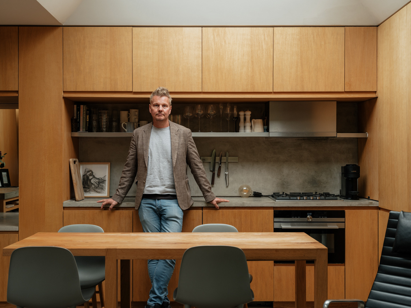
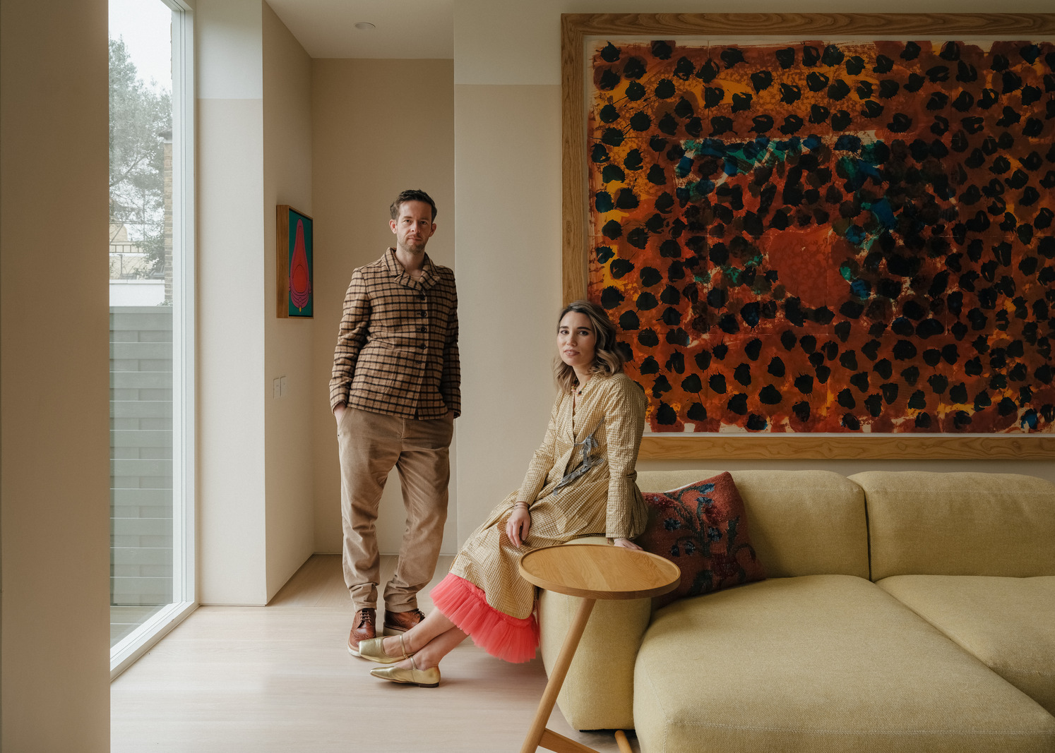
Lawyer George Cotter and design director Kristie Malivindi on the Brooklyn-inspired renovation of their Victorian home in Clapham, south-west London
January 24th, 2022
January 24th, 2022
This article is more than a year old and may contain information that is out of date. Sorry about that.

Although the 10-year home of lawyer George Cotter needed a little love, it wasn’t until his partner, design director Kristie Malivindi, moved over from Brooklyn, New York, that he decided to renovate. After all, it gave them an opportunity to, quite literally, create a home together. There were things Kristie had to leave behind – such as the sweet chewy bagels, that, she insists, just aren’t the same in London – but she also got to bring a bit of Brooklyn with her, namely in the form of the industrial material palette that they used to transform George’s typical Victorian terrace house. Oh, and her cat, Gaspar.
Following a few nifty Google searches, George and Kristie discovered Rise Design Studio and immediately felt a connection to its back catalogue of light-filled homes. The practice was able to refine the couple’s ideas – Kristie had a particularly hefty portfolio of references – in all the right ways. What started with a renovation of the kitchen, ended with a total transformation of the house: it was practically demolished and built right back up again. It couldn’t look – much to Kristie’s delight – further from its previous outdated self. Here, George and Kristie share details of the project and explain why, along with the architecture of Brooklyn, the Apple store was one of their greatest inspirations.


George: “I always wanted to renovate but I got a little too comfortable with the house. I’d been living here for 10 years but what really accelerated my thinking about it was Kristie. She was moving over here from Brooklyn and I thought it would make her feel more comfortable living in a new country if she could participate in making a home her own. Everything just came together – it took some time for me to go for it, but the timing worked out well.”
Kristie: “It looked like the last time the house had been done was the 1990s. It was like a post-Friends design – it had that kind of colour palette. I was ridiculously excited about the renovation. I had to convince myself and George that it wasn’t the sole reason I was moving here! In Brooklyn, you don’t have houses like this – it’s all apartments and studios. It almost felt like a film: I was moving to a foreign country and creating my dream home.”
George: “Our initial ideas were quite conventional, but they just kept developing and we kept going. What started with the kitchen evolved into the ground floor, the bathroom, replacing a bedroom with an en suite and finally converting the attic into an office. Before we knew it, we were doing the whole house.”
Kristie: “We came across Rise Design Studio from Google searching. There was one particular house that they’d done with a glass envelope extension and thought, ‘That’s it. That’s exactly what we want.’ We had a good feeling about the practice. When we met them, it was a given we would work with them because they were so genuine – and George connected with the director because they’re both from Northern Ireland.”

George: “They had lots of interesting ideas about materials and technology, but Kristie had put together a very detailed brief of what we wanted it to look like.”
Kristie: “The starting point was one of George’s favourite places in the world: the Apple store. Every aesthetic choice they make there is very considered and understated but perfect. The funny thing is that, like George said, he had grown complacent with the house as it was. He can live in a space and completely ignore the aesthetics around him, but he actually has very refined taste.”
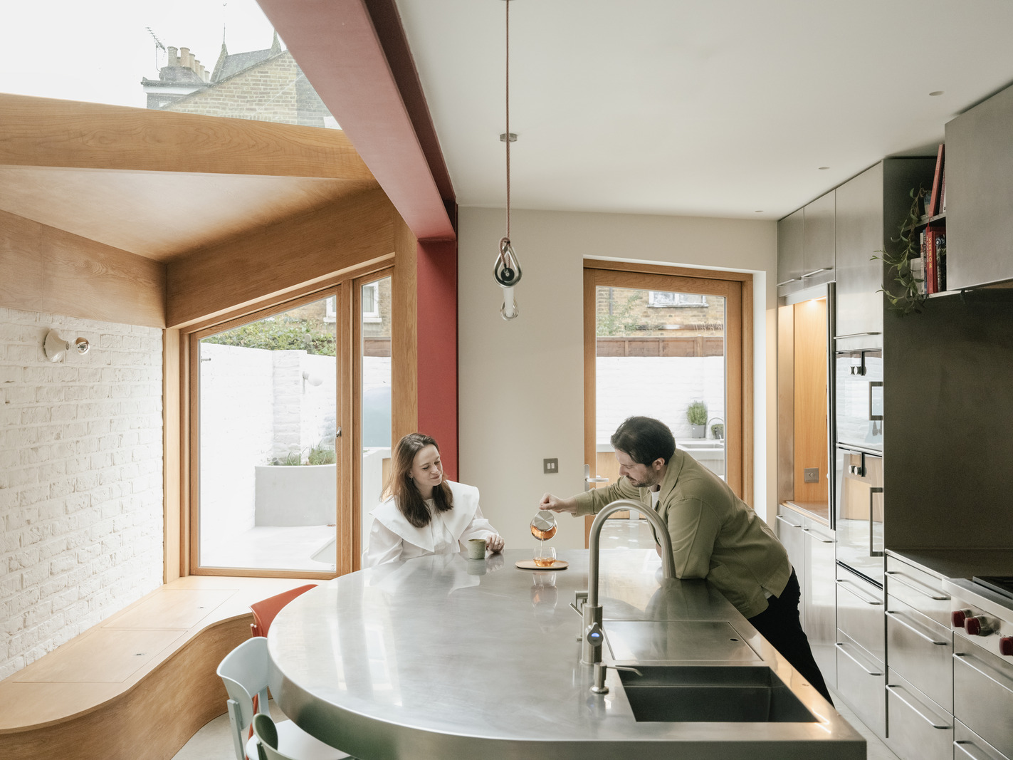
George: “I’ve always loved how much thought Apple put into the store’s design; the way they select the materials and the atmosphere that it then creates. I love the one on Regent Street and the village-square feel it has; I love the one in Brooklyn, which has exposed brick walls and concrete floor. It feels very modern and very clean, but at the same time it doesn’t feel cold or tacky. It’s very warm, welcoming and there’s lots of light coming in. I thought that it would be interesting if you could, say, take these ideas and put them into the kitchen.”
Kristie: “I just naturally gravitated towards an industrial palette because you get it a lot in Brooklyn: the exposed brick and concrete. It felt like a very natural choice for me. It feels like home.”


George: “I love the materials. I’m very pleased we went with the industrial Brooklyn look.”
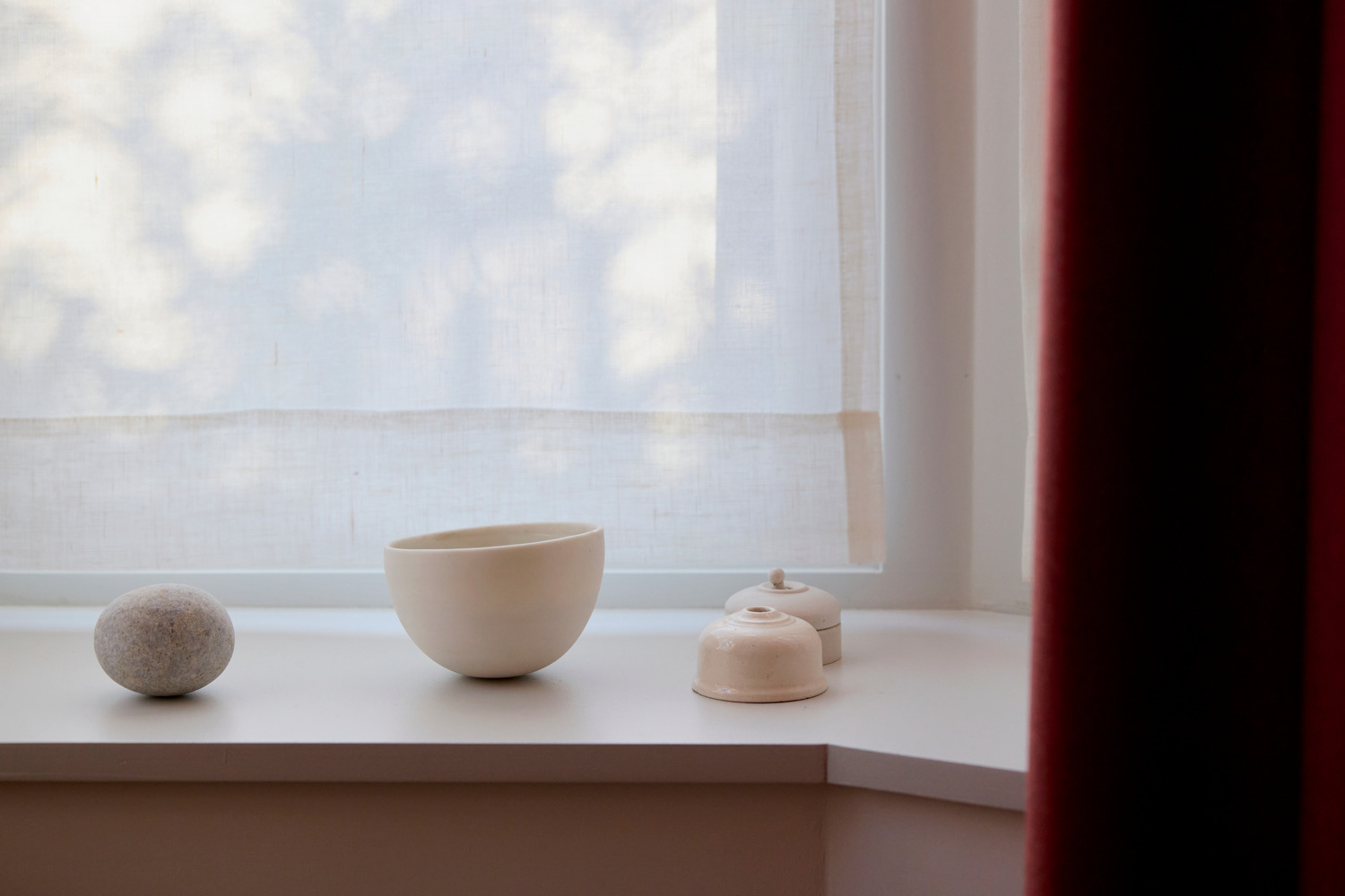
Kristie: “The spotted bathroom was inspired by something I saw when I went to Milan design week. One of the exhibits was an apartment with interiors by File Under Pop; they had a bathroom with black-and-white spotted tiles and I fell in love. I said to George, ‘It might sound crazy, but we’re going to need a floor-to-ceiling spotted bathroom.’”
George: “I really like it! It’s really striking. It’s different from the rest of the house, but a bathroom is a room where you can do that – you can take it in another direction because it’s self-contained. There’s a lot going on in there and yet it’s somehow quite clean.
“The renovation took nine months. It’s funny – we had been agonising over the plans and about tiny details, things like potentially moving the door of the bathroom two inches to the right. We thought it was a big ask but the builders shrugged it off as fine. Then one day, I came to visit the site and to my surprise, they had pretty much demolished the whole house! That tiny detail was in fact totally insignificant, as they were going to knock the door down anyway!


“It was an extraordinary experience to walk around it in that state. The house was built around 1870 and you could really see the age of the place. The whole process of seeing it reduced to nothing and then taking shape again was amazing.”
“Throughout the process, we talked about light – and the light you get in here now is amazing. In the summer, when the light comes through the windows and we open up the doors and a gentle breeze comes through, it’s spectacular.”
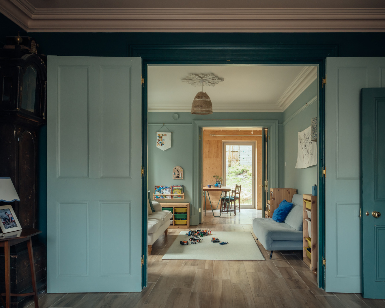
Kristie: “The kitchen is just incredible. Especially in the warmer months. George loves cooking, so when we have people over, he can just be fussing around the food, while we all hang out with him in the space. The kitchen has become the heart of the home. Then we have the total opposite in what’s become the TV and nap room. Since it’s in between the kitchen and the front living room, it has no windows and gets the least light in the house. It was George’s idea to embrace that and paint it a dark colour and make it really cosy. And we love it.
George: “What’s really nice is that we use the entire house now. Before there were huge portions of it that didn’t get used. Whereas now the amount of space we use in the house is just magnified. It’s really tailored to how we use it and every room has its function. And that’s really satisfying.”
George and Kristie, how do you define modern living?
Kristie: “To answer this question we need to acknowledge how fortunate we are, for being able to re-do the house and consider every detail. For us, modern living is the classic design formula – form and function. It’s about creating a space that feels calming and comfortable, and works hard for all the ways we exist in our homes today.”

RELATED ON THE MODERN HOUSE