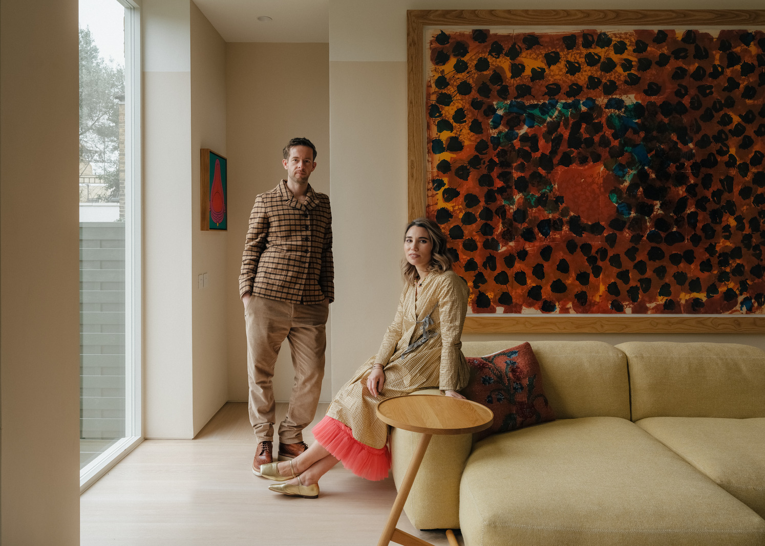
My Modern House: architect Mat Barnes and his wife Laura Dubeck on creating a flexible, imaginative space for their young family at a playfully renovated Edwardian house in south London
January 20th, 2021
January 20th, 2021
This article is more than a year old and may contain information that is out of date. Sorry about that.

Laura: “The house wasn’t actually on the market, but it was next door to my best friend’s parents and had been sitting empty for six years. We made enquiries and it turned out that it had been inherited by someone in Poland, who thought it was too much of a wreck to sell. It was semi-derelict with a broken boiler and damp problems, but we were game for a project. We offered what we could afford and amazingly it was accepted.”
Mat: “Before we bought this house in 2019, we had been living in a semi-detached 1960s house in Crofton Park. It had a very nice square plan and we always thought that when we moved to a larger house, it would be something of a similar age. But this was just too good an opportunity to pass up.”


Laura: “We knew exactly what we were entering into, but we must have been mad looking back – our daughter, Aurie, was one and I was pregnant with Sidney, who’s now six months old! Our plan was to do the work as quickly as possible and to make sure we had a joyful family home by the end of it. The house fronts onto a big park, which I don’t even remember being something that attracted us to it when we first saw it, but we now feel amazingly lucky to have it.”
Mat: “We moved into the house in August 2019 and waited to get planning permission for the extension. We didn’t have a working shower and the ceilings were caving in, but living here before work started wasn’t a bad thing as it helped us see what we wanted from the renovation.
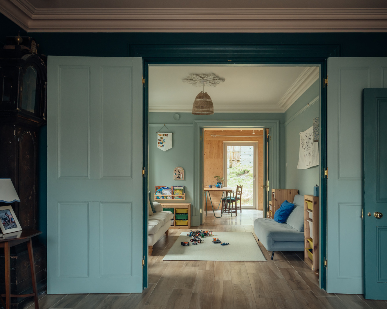
“The main problem downstairs was that it was a network of tiny rooms. The kitchen was essentially a scullery and there were huge chimney breasts taking up lots of space. We wanted to open it all up to create one living, dining and kitchen area, which would lead out into the garden through a new extension at the back.
“Upstairs, we decided to add an extra bedroom and bathroom to create three double bedrooms and a small nursery, and we also opened up the existing ceiling, adding a skylight and exposing the original rafters.
“On the ground floor, the back garden sloped down from the house by about a metre and half and there were quite a lot of level differences throughout the house. I lifted up the floorboards in the back room and realised there was about a metre gap to the foundations, which allowed us to bring the floors down and therefore spread the level changes across the whole ground floor with steps rather than have one huge drop to the garden.”


Laura: “Once planning had been approved, the work started in January 2020 and we luckily had family just a couple of miles down the road who we moved in with. It meant that we could make decisions for the finishes on site as the renovation progressed. There were moments when we were both overwhelmed by the number of choices we had to make every day, but it also made us think quickly.”
Mat: “Although I work mainly on private residential projects and exhibition designs, it’s particularly hard to make decisions when it’s your own house. I felt like it was going to be viewed as a representation of my architectural style when in fact variety is key to my work. I’d never want to do the same thing over and over again – that’s what keeps my job interesting. That said, I’d realised early on in my architecture career that good taste wasn’t all about white walls and concrete floors.
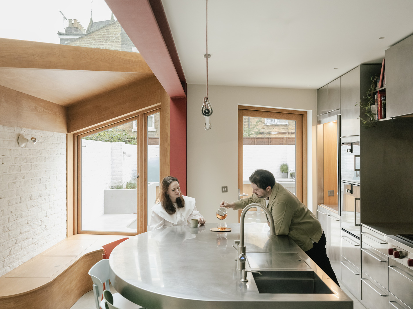
“I was really keen for the house to reflect the semi-derelict state that we originally found it in, so we left the original back wall between the kitchen and the extension in a partially demolished state. It was inspired by the stereotypical crumbling wall in a scene in Trainspotting, but it’s staggered shape also means it’s very good for putting plants on.
“Our starting point for most rooms was to strip everything back and see if we can use the finish or material we’d exposed. In the kitchen area, we stripped back the wall to bricks and then decided to leave it and just paint it to tie in with the crumbling end wall.
“We wanted to include some reference to the construction process, so had the structural steel columns in the extension painted red and white to mirror the ranging poles used in surveys.


“The idea for the mountain-topped roof on the extension came from some images I saw of the construction of the Matterhorn Bobsleds ride at Disneyland, which is made from this complex steel framework and then topped with this incredibly realistic scenic mountain. I liked the idea of making the structural elements of the extension, such as the blue laser cut tresses and thin steel poles, look as thin and fragile as possible by putting something seemingly huge on top. I couldn’t think of anything that would look heavier than a mountain. It’s actually made from foamed aluminium – a material that’s so light that you can lift the whole thing up on your own. It’s all a bit tongue in cheek.
“Lots of the house’s design is based on elements of the landscape – the concrete wall in the open-plan kitchen living area feels almost cave-like and I designed the enamel dining table to resemble rippled water on a lake. The kitchen units are made from recycled chopping boards and milk bottle tops and we’ve also used it for the window lintels upstairs. I love its graphic quality.
“My love of pop-art and graphic culture is reflected throughout the house. The ‘Waste Not Want Not’ motto on the steps leading down to the kitchen is inspired by a phrase on a 19th-century bread plate by the architect, A.W Pugin. It was also one of my grandmother’s key phrases in the kitchen.”
Laura: “Although I trusted Mat’s vision for the space, I struggled to get my head around some of the ideas, especially the mountain. Mat’s often the one with wacky ideas and I’m the one who challenges them, but being together has definitely opened my mind and shown me that bold design can make you live in a space in a much more present way.
“It’s amazing seeing the house through the eyes of our children too – Aurie loves showing her friends the mountain and doesn’t actually see what’s so special about it at the moment. She thinks everyone has one in their back garden.
“The checkerboard tiles walls in the extension and the blue and white check bathroom upstairs were inspired by a fireplace we uncovered while renovating. In terms of colours, the more tonal shades came from me while the brighter ones are down to Mat.”


Mat: “The front deep blue living room is my take on the Sir John Soane Museum in Holborn that I’ve designed an exhibition for. I went to a local plaster maker and asked if they had any seconds or wasted bits – he gave us these remnants for free and we then painted them the same colour as the walls and ceilings.”
Laura: “I love sitting on the orange sofa in front of the checkerboard tiles in the extension. It’s almost as if the extension was designed around it, but it was actually a hand-me-down from some friends. It’s the perfect place to watch the children, keep an eye on what’s cooking in the kitchen and look out into the garden with its beautiful old cherry, plum and apple trees. We love borrowing Aurie’s binoculars and looking out at the birds.
“There was a five-month delay getting the doors made for the extension due to the pandemic, but we ended up moving into the house in July last year and living with the back boarded up until the glass arrived in September. Since then it’s been a really lovely process of gradually filling the space with our things – a lot came with us.
“The budget only went so far, so there are a few elements we’d like to finish off. Eventually we’d love to add an ensuite into the little box room next to our bedroom. When we planned out the house, we defined exactly how we’d use each room but we’ve realised we don’t need to be so rigid. We’re still learning how to use the space, but we’re using it in a much more flexible way then we’d anticipated.”
Mat and Laura, how do define modern living?Mat: “For us, it’s about having ultimate adaptability and living in a space that allows maximum flexibility in the future. This is reflected in how we’ve designed this house – apart from the kitchen, none of the furniture is built-in and we can simply rearrange it as our family needs change.”
Is there a home for sale on our website that has caught your eye?Mat: “We really love Harfield Gardens in Camberwell, which has been cleverly renovated by Studio MacLean with bright colours and patterns. It was built in 1979 and we love that age of house – the rooms are square and there’s always lots of light.”

RELATED ON THE MODERN HOUSE